Two years ago, I gave a microcopy workshop at an Israeli startup called Switch. When I got to their offices in the morning, there was a sign on the coffee machine that said: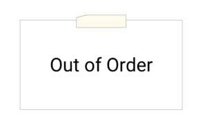
I didn’t have any choice, so I started the workshop without coffee, but it turned out all right after all. How do I know that?
When I finished and walked by the same coffee machine at the end of the day, I saw that during one of the breaks, someone from the workshop changed the sign, and it now said: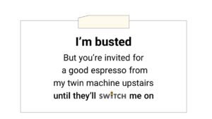 Well, this isn’t exactly microcopy, because it’s not a digital product, it’s a paper sign. But the difference between the two signs is the essence of microcopy:
- The old sign is technical. It talks about the machine. The new sign is much more human. It speaks to YOU about YOU. It sounds a bit like two people having a conversation.
- The old sign is vague. It tells you that there’s something wrong with the machine, but it leaves you with questions: Where and when will I get my next coffee, and are you fixing this? The new sign makes everything clear—it’s as if the person who wrote it asked, “When someone is standing in front of a broken coffee machine, what would they want to know?” Then they wrote the answer.
- The old sign is a dead-end—no coffee for you. The new sign enables action. It tells you what you need to do to end up with a cup of coffee in your hand.
- The old sign is a bummer—you walk away disappointed. The new sign makes you smile. Even though the coffee machine is broken and you can’t have coffee right now, you smile, and this is a huge difference in the user’s experience.
Human, clear, motivating, and enjoyable—these are the four guidelines for writing good microcopy.
But first, what is Microcopy, or UX writing?
Microcopy is the words and phrases in a digital product that directly relates to the user’s action. By ‘Digital Products’, I mean websites and apps, of course, but also complex systems, professional systems, and digital kiosks, like ATMs.
Microcopy comes:
- Before the action: to motivate users to act, like in CTAs and onboarding.
- During the action: like in control labels, assistive copy, hints, tooltips, buttons—all the guidance we give our users.
- After the action: error messages if something went wrong, or success message if the action was completed as intended.
The term UX Writing usually includes the whole process of creating excellent microcopy for a product: research, writing, iterations, tests, working with designers and developers, and more.
As we saw earlier with the two signs, these words can be disappointing and frustrating, but they can also make the connection with our users more human, clear, motivating, and enjoyable.
Let’s go through each one of these guidelines, and in the end, we’ll see how they all relates to the ROI of microcopy, or how can every business benefit from having better microcopy.
#1 Be human: Use conversational writing.
Why should machines sound human, you ask? I strongly recommend reading the book The Man Who Lied to his Laptop by Professor Clifford Nass and Corina Yen, from Stanford University. Professor Nass conducted 100 experiments in order to study the connection between human users and digital UIs (user interfaces).
One of his most interesting discoveries was that human users expect digital products to act according to human social norms. When the digital product fails to do that, humans are put off or even offended. Users will even walk away angry from a UI that sounds like a machine instead of a human.
In order to understand how to “sound human,” we need to go back a few years. Not so long ago, there was a very clear distinction between the language we used for writing and the language we used for talking.
The language we used for writing was formal. It used complex, longer sentences, and words that we often wouldn’t say in face-to-face conversations.
The language we use for talking is much more dynamic. It uses shorter sentences and everyday words that the person in front of us can easily understand. This language is short, quick, and flowing.
But the Internet changed everything. On the internet, we write words, but we’re actually having conversations with our users—we ask them something, they answer on the spot; they click a button, we give them immediate feedback. Words on the internet function more like a conversation, and less like written correspondence.
Erika Hall sums it up in her excellent book Conversational Design which says that technology is breaking down the traditional categories of Writing vs. Talking and is creating a third option: conversational writing.
How does conversational writing sound? Well, just like a conversation. It:
-
addresses the user directly
-
sounds natural
-
is short and to the point
-
uses everyday words
-
has an active voice
-
Flows
This, for example, is definitely not conversational writing (or good UX copy):
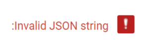 Imagine the user is standing in front of you. You would never say “:invalid JSON string.” They would look at you as if you were speaking a foreign language. Which is exactly what this is. So how would you talk them?
Not write, but talk.
In that specific case, I was trying to upload a photo that was too big. So how would I explain that mistake to a user? I tell them what went wrong, I tell them how to fix it, and I use everyday words that everyone can understand.

It’s obvious that the general public will not understand technical terms like “JSON string.” So we should replace terms like this with conversational language.
But sometimes it’s more subtle. For example, it’s okay to write:
Please choose the preferred payment method
But if I imagine a user standing in front of me, I would just say:
How would you like to pay?
The first sentence is longer. It uses passive voice and words we usually don’t say, like ‘preferred’ and ‘method’. The second sentence is shorter. It flows and it sounds like what you would say if you are having a conversation. And this is precisely what we aim for.
Here’s an example is from the Pinterest mobile app. They don’t say “Please allow Pinterest to access your camera”, but instead ask a super simple question that sounds a lot less intimidating:
 This is Gmail introducing a new feature:
 Notice Gmail doesn’t use words like ‘postpone’ or ‘delay.’ They say ‘deal with later,’ ‘snooze it.’ This way, users easily understand what that feature does and how it helps them. This is what conversational writing does.
The next example is from Microsoft Office. If you’re not an Apple or Mac user, you probably noticed the huge change in Microsoft’s language over the past couple of years, from a highly technical, formal style to conversational writing. This is a great example:
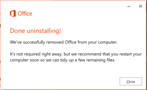
When I got this bit of microcopy, I had just uninstalled one of their products. They’re not giving me a hard time using technical terms and complex sentences. They talk to me and explain the situation in a super friendly way.
All of this takes us to a very common question: Can we use conversational language in professional and complex systems? By professional systems I mean CRMs, engineering systems, banking systems, and so on.
In two studies conducted by Nielsen Norman Group, they came out with these findings:
- Even traditionally dry industries like finance can benefit from a little conversational language. In a comparison between two landing pages for banks, the page with more casual copy was perceived as friendlier and more trustworthy than its serious counterpart. Respondents were more likely to recommend it and described it as ‘approachable’ and ‘straightforward’. The formal bank was described as ‘dull’ and ‘intimidating’.
- Domain experts in science, technology, and medical fields—even highly educated online readers—crave succinct information that is easy to scan, clear, concise, devoid of unnecessary jargon or complex terms.
So yes, we should use conversational language in professional systems. Here’s an example of how this all works.
SAP is a software company that develops complex systems. They have spent decades communicating with their customers using stilted, formal and technical language. But they understood in order to communicate better with their customers, they had to start the change somewhere. These are a few of the changes they’ve recently made in one of their systems:
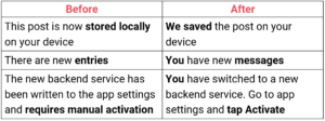 What did they change?
- The focus moved from the system to ‘you’ and ‘us’;
- Words like ‘stored locally’ and ‘entries’ were replaced with everyday words like ‘saved’ and ‘messages’;
- The complex sentence ‘inquires manual activation’ is now short, active and simple – ‘tap activate’;
- The long sentence is split into two short ones.
Professionals are just like other customers: they too deserve guidance that actually simplifies the User Interface rather than making it more complex than it already is. Writing in a conversational style means we’ll help them easily understand our product.
#2 Make everything clear: Be helpful, answer questions in advance and spot possible concerns.
Our users and us (developers, product makers, marketers, and copywriters) share the same interest: we all want our customer to complete an action successfully—whether it’s downloading something, trying a demo, submitting a form, registering, buying… whatever. We want them to get to the finish line as quickly and easily as possible.
To achieve that, we need to identify and spot potential friction points, where users can get stuck, delayed, or even quit the product altogether. We need to step into our users’ shoes, go through the user experience, and ask:
-
What might users misunderstand or not know how to do?
-
What might make them concerned or suspicious?
-
What will bring them to call support or give up?
Once we identify these questions and concerns, we can address any objections in advance, thus helping users to continue smoothly and increase completion rates.
Sometimes, the fixes are a bit counterintuitive. In a webinar presented by Sara Walsh, she shared how she doubled the number of words in a form on Capital One‘s website, giving up white spaces and adding assistive copy around the fields to answer users’ questions and instruct them. This resulted in tripling the form completion rate from 26% to 92%. The extra words made it more clear what the user needed to do.
Let’s see a few more examples of common friction points and how to deal with them.
Friction point #1: What does that mean?
Whatever industry you’re working in, you probably have many industry-specific terms that outsiders will not understand. Like this example from The Noun Project icon store:
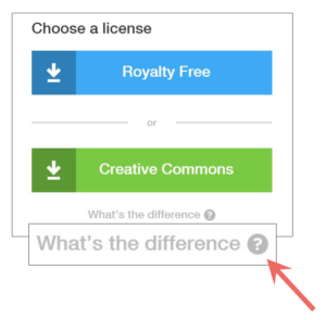 The person who wrote the microcopy for this product knew that not all users would know the difference between the two licenses they offer. So they wrote down the exact question: What’s the difference? And gave the answer in a tooltip—a definition for each license.
This way, users don’t need to Google it or exit the product interface to find an answer… which is good because if they leave, they’ll end up scrolling through their Facebook feed and may never come back.
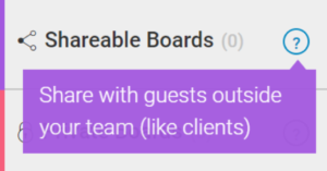
Friction point #2: What does that do?
Here’s an example from Monday, the team management tool. When developers name the different features in a product, they may create a unique convention, and new users might not understand it. So we need to give them an explanation for what that name means and what the feature does. Monday does a great job using colorful Tooltips to explain the possibly vague term “shareable boards”:
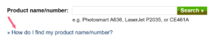
Friction point #3: Where do I get the information?
This example is from HP. At one point in the registration process they ask you to enter the name or number of the product you want to register. In case the user doesn’t know it, they also give a question with a link—how to find this information. When the user clicks on it, they get the answer with an image that clarifies everything:
 Friction point #4: How to write it?
This is a form you would use to connect a bank account with a PayPal account. PayPal gives users a hint about the correct formats (2 digits, no spaces), and also suggests where to get the information from. Notice the simplicity of the language:
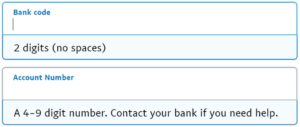 PayPal has thought through the process to help the user complete this form without getting a frustrating error messages along the way.
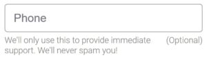
Friction point #5: Why do you ask for these personal details?
When we ask users for their personal information, like birth date or phone number, they’re concerned with their privacy, and want to know why the product maker need this information. So tell them why.
This is, again, from Monday:
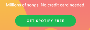
Friction point #6: Is the free trial really free?
The main concern users have when they consider activating a free trial is that as soon as it expires, we’ll start charging them. So Spotify, like many others, addresses this concern by stating upfront that there is no credit card needed during the registration process, which means they can’t charge users when the free trial expires.
Friction point #7: Fear of spam
When users give us their email address, they may be concerned that they’ll get spammed or that their address may be shared with third parties. On the checkout form of Sugru, there’s a checkbox offering users to subscribe to Sugru’s newsletter. Right next to it, they specify the frequency:
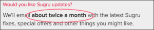 Michael Aagaard has shown that adding this kind of reassuring message increase conversions by almost 20%. But even more interesting, it turns out that it really matters how we say it, and that we might not want to use the word ‘Spam’, which lowers conversions. Here too, testing is crucial.
There are many other possible friction points:
- In online stores, users are concerned with who’s going to pay for the return shipment if something is wrong with the product.
- On financial websites, we probably need to add a lot more explanations to industry-specific terms.
- If we want users to register using social media accounts, we need to promise them we will not post on their behalf and will not share the private information they just gave us access to.
And there are many more questions and concerns, it depends on the product and the industry.
So go over your product, identify these weak points and address them in advance using microcopy.
#3 Motivate users to act. Open the door for them and give them a good reason to step in.
Microcopy is not acquisition marketing, it’s user experience (UX), but it shares some elements of marketing like motivating and calling to action. Every digital product has micro-actions that product makers want users to take that are not specifically related to selling. For example:
• Sign up for our mailing list
• Allow access to contacts, location, camera…
• Add to calendar
• Rate us
• Give cookie consent
• Remove ad blocker
• Try a new feature
• Sign up to our website
• Fill a profile
• Contact us
• Start a conversation
• Share with friends
• Run another search
and on and on…
In order to motivate users to take these micro-actions and increase in-product traffic, we use a very basic marketing principle, which is:
If you want someone to do something—you need to give them a good reason to do it, and tell them how will they benefit—how would their lives improve from taking this action.
Don’t talk about yourself or your product. Talk about them.
For example, if we want users to share our product with their friends, it will not help to tell them how sharing it will help the product grow, because most users are not interested in helping us grow our product (surprise surprise). Instead appeal to the user’s interests.
The Infatuation is a restaurant recommendation website. When they want users to spread the word, they don’t talk about how great their product is, they say:
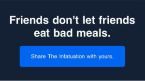 In other words, your friends will thank you and love you more if you share The Infatuation with them. Friends’ love is something that people care about, something that people really want and willing to do things to get it.
If we want users to sign up for a newsletter, it’s not enough to write “Sign up for our newsletter” because that doesn’t say what’s in it for them. This next example is from Good UI, basically saying: We do all the work, you get the results to learn from.
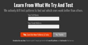
Users who read this microcopy get a solid idea about what they’re going to get if they sign up. They read and think: “Oh, this is actually interesting, I want that”.
This is Medium‘s join page. Medium wants users to create accounts, of course, so they tell them how it will improve their experience:
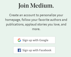 These are all features that Medium’s users need to get the most out of the platform. So pointing all of this out helps increase the user’s satisfaction and click-throughs.
Another way to increase in-product traffic is to make sure we have no dead ends in the product experience… that we never say to users “there’s nothing to see here”, but rather present the next step or give an alternative.
The average app loses 77% of its daily active users within the first 3 days post-install. Within 30 days, an app loses 90%. One of the reasons, according to Dina Chaiffetz, is the first impression, where microcopy for empty states is not educating, delighting or motivating. In fact, it might be non-existent.For example, a shopping cart can potentially be a static dead end like this one:
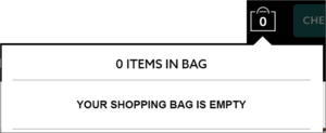 But look how Society6 turned that dead-end into an open door:
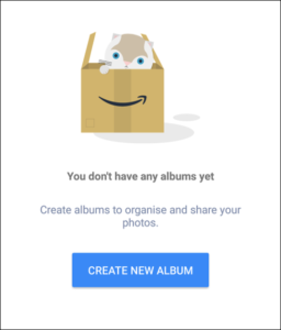
 On Amazon Photos, if you haven’t created any albums yet, they don’t just say ‘No albums’, but rather tell you how albums can help you, Then there’s a CTA on the button, so you can actually go ahead and create one:
 Want to see more? Take a look at this website with a huge collection of empty states for inspiration.
#4 Create an enjoyable journey. Make the users smile, compliment them, make them feel good.
There’s a very common misconception that microcopy should be cool and funny all the time. That’s a mistake. In fact, most of the time microcopy should be quite serious. As we saw in the other guidelines, microcopy aims to help users, answer their questions, and motivate them, not to amuse them.
So if the brand or the product or the situation are not meant to be funny, don’t force it, it will sound and feel unnatural, and your users will pick up on it.
But if the brand’s voice and tone are spiced up with a little joy and fun, then humorous copy is our best friend. Whenever we make users smile, we make them feel better about themselves, they love the brand more for making them smile, and they’re more willing to act because they’re energized. These are all findings by Professor Clifford Nass and shared in his book (referenced above).
How do we make users feel good?
This is from a website called Imperfect Produce. They sell fruits and vegetables that people don’t want to buy just because they look, well, ugly. So what’s more appropriate for a welcome page than saying:
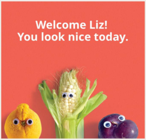 This image, by the way, is from the vibrant international Facebook group Microcopy & UX writing. If you are interested in microcopy you should check it out.
This is a success message after uploading a profile picture to the vegan website Happy Cow:
 Compliments like these are effective and make users feel good about themselves even though they know it’s not a real human expressing a deeply felt thought (it’s machine-generated). We humans are strange creatures, so go ahead and be generous with compliments. And take it as a tip for life too.
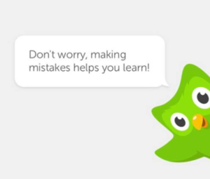
If users have a negative experience that might make them upset, don’t leave it this way. Cheer them up. Here’s how Duolingo does it:
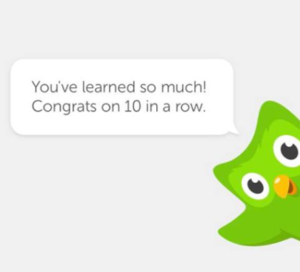
And when users are happy, celebrate with them:
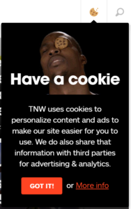
 Here’s an example from The Next Web asking for cookie consent. The combination of the image and the copy is a winner.
On loading times users don’t have anything to do, they just sit and stare at the screen, so these are great opportunities to sprinkle some surprises along the way. This example is the loading time for the 8track app:
 Error messages can also be funny, but be careful. Error messages should always be clear and helpful above everything else.
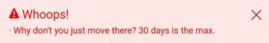
This is from Hipmunk, the vacation planner. When you try to book a hotel for more than 30 days it tells you:
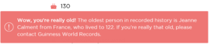
If you write you’re over 122 on OurHome app, you get this hilarious error message:
Okay… these four guidelines are very user-centered. But what about the business side?
What’s microcopy’s return on investment (ROI)?
How can every business benefit from having better microcopy?
The ROI of microcopy.
- Better microcopy gives users fewer reasons to leave the user experience. They understand things better because we say everything in conversational language and address all questions and concerns in advance.
- At the same time, users have more reasons to act, because we show them the benefits of the product, open doors for them and make them feel good about themselves and about us.
If fewer people leave and more people act, it leads to more users that successfully complete the desired action (i.e. conversions and purchase), and with a smile on their face (which means they’ll come back for more conversions and purchases).
 Kinneret Yifrah is the author of Microcopy: The Complete Guide, the highly recommended book that offers practical guidelines for writing microcopy, more than 300 screenshots from real-life products, and tons of tips that will show you where every word goes. Copywriter Club members (that’s you) can save by using the discount code: TCC15 when purchasing.
Looking for additional resources? Check out this cool library of UX writing resources, with more books, people to follow, guidance for entering the field, communities to join, podcasts and courses.